Select a region


The doctor heading Jersey’s response to the corona crisis has released the latest data guiding the government's actions - but what do these graphs actually mean?
The statistical modelling was released during a web conference with Medical Officer of Health Dr Ivan Muscat yesterday, in which he provided an update on plans to step up testing in the island.
As well as announcing that 150,000 ‘immunity’ tests are on their way to the island amid growing pressure on the government to introduce mass testing, Dr Muscat gave a detailed presentation on where Jersey is in relation to the epidemic ‘curve’.
Video: Watch the web press conference (Facebook/Government of Jersey).
Express takes a closer look at the graphs presented by Dr Muscat at the briefing...

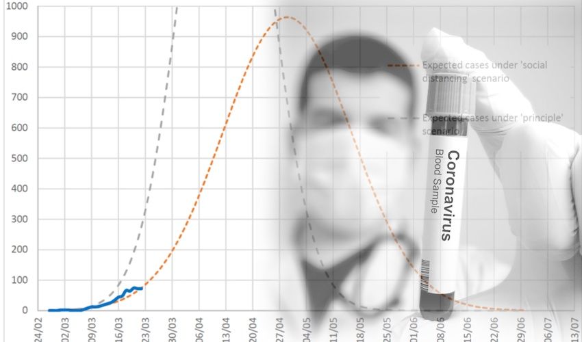
Pictured: Comparing Jersey cases with the projected scenarios.
Here, Dr Muscat shows what the infection rate would look like in Jersey if the government hadn’t put in any preventative measures such as social distancing or the instruction to ‘stay at home’ – signalled by the blue-grey dashed line on the graph.
The orange dashed line shows a projection of how that rate of infection is reduced by the various public health measures Government have introduced to date.
The continuous blue line starting in the bottom left hand corner shows an approximation of Jersey’s actual infection rate so far.

Pictured: A closer look at Jersey's curve.
This slide shows a zoomed-in version of the previous one, getting a little closer to the data points displayed on the graph.
Here, Dr Muscat points out that the continuous blue line has been created by multiplying the positive cases by ten because not everyone presenting with symptoms is being tested.
The Medical Officer explained that health officials “only observe one in ten cases” and therefore this multiplication allows the government to compare Jersey’s current position with the two other predicted scenarios.

Pictured: The rate of infection.
Once health officials have the blue line from the previous two slides, they can assess how often the number of patients with the virus in Jersey is doubling.
This slide shows that, so far, Jersey’s corona virus cases are doubling between every three and five days.
Dr Muscat announced at the conference that, from now on, Statistics Jersey will be publishing this level of information to the public, accompanied by an explanation.
He explained that this modelling is important as it helps to “reinforce the recommendations we have made”, including ‘stay at home’ guidance, social distancing for those who leave the house either in the two hours allowed or for essential workers who are still allowed to carry out their duties, and advice for hand washing and respiratory hygiene.
Dr Muscat also emphasised that this kind of modelling allows the Health Department to maintain “patient confidentiality".


Comments
Comments on this story express the views of the commentator only, not Bailiwick Publishing. We are unable to guarantee the accuracy of any of those comments.